7 Japandi Colors That Create a Calm, Warm, and Intentional Space
7 Japandi Colors That Create a Calm, Warm, and Intentional Space
Warmth does not always come from adding more. Sometimes it begins with color — with softer tones, gentler contrast, and shades that let a room breathe. In Japandi design, color is not just visual. It is emotional. It shapes how the space holds you.
Calm spaces are built in layers
If Series 1 gave you the foundation, this guide shapes the atmosphere. Color is one of the quietest ways to make a room feel softer, warmer, and more intentional without overcrowding it.
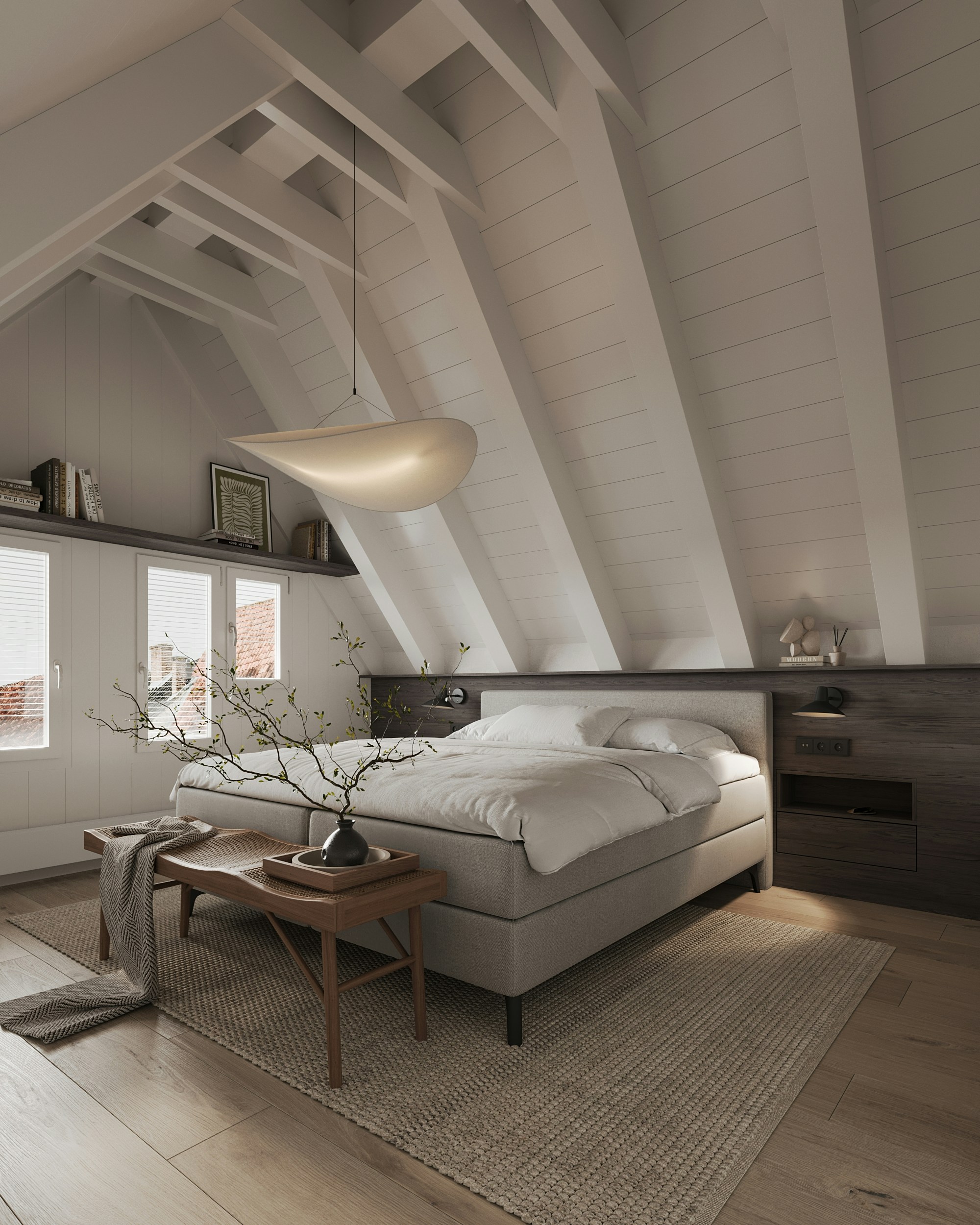
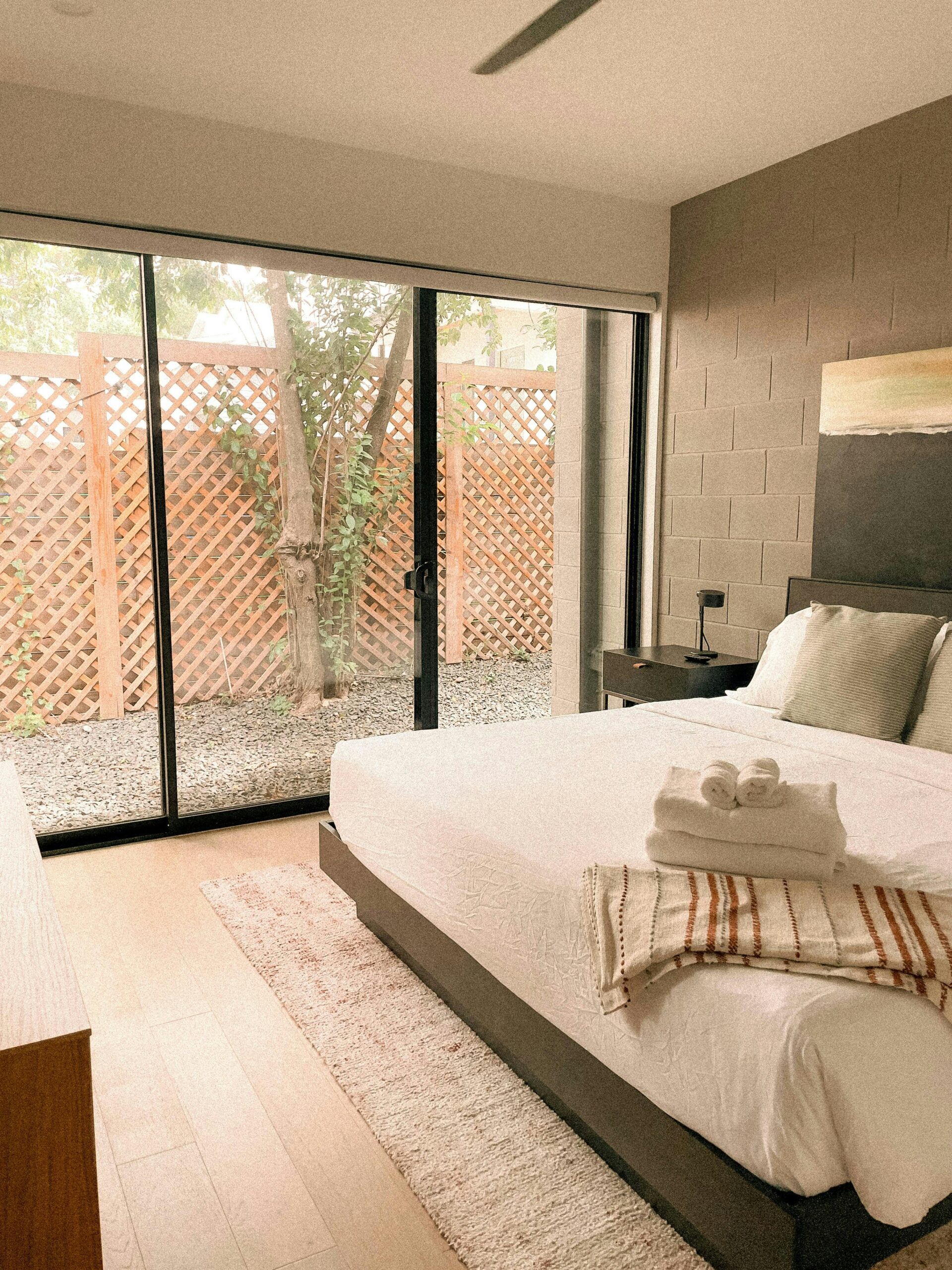
Japandi interiors are known for their calm, warm, and minimal atmosphere, and the color palette is one of the quiet reasons why. Instead of bright or overly bold shades, Japandi spaces lean into warm neutrals, natural wood, muted earth tones, and soft colors inspired by nature itself.
These tones make a room feel peaceful, balanced, and comforting without becoming plain. They support natural light, soften clean lines, and help every texture feel more alive. Over time, the room starts to feel less styled and more aligned — a space that meets you gently at the end of the day.
This post may contain affiliate links. As an Amazon Associate, I earn from qualifying purchases.
What Colors Define Japandi Style?
Most Japandi palettes combine warm whites, soft beige, natural wood tones, muted gray, gentle greens, and a few darker accents for contrast. Together, these colors create a room that feels grounded and easy to live in. Nothing is shouting. Everything is supporting.
This is what makes the style feel so timeless. It is not built around trend. It is built around harmony — a quiet balance between warmth and restraint, softness and structure, simplicity and soul.
If you are building your room step by step, start with the essentials first, then return to color. The room will feel more cohesive when the foundation is already clear.
1. Warm White
Warm white is the foundation of most Japandi interiors. Unlike pure white, it carries a softer undertone that makes a room feel calm, bright, and welcoming without looking stark. It gives the eye a place to rest and allows natural light to move gently across the space.
On walls, bedding, or ceilings, warm white creates the feeling of quiet clarity. It opens the room while still keeping it soft. It is minimal, but never empty.
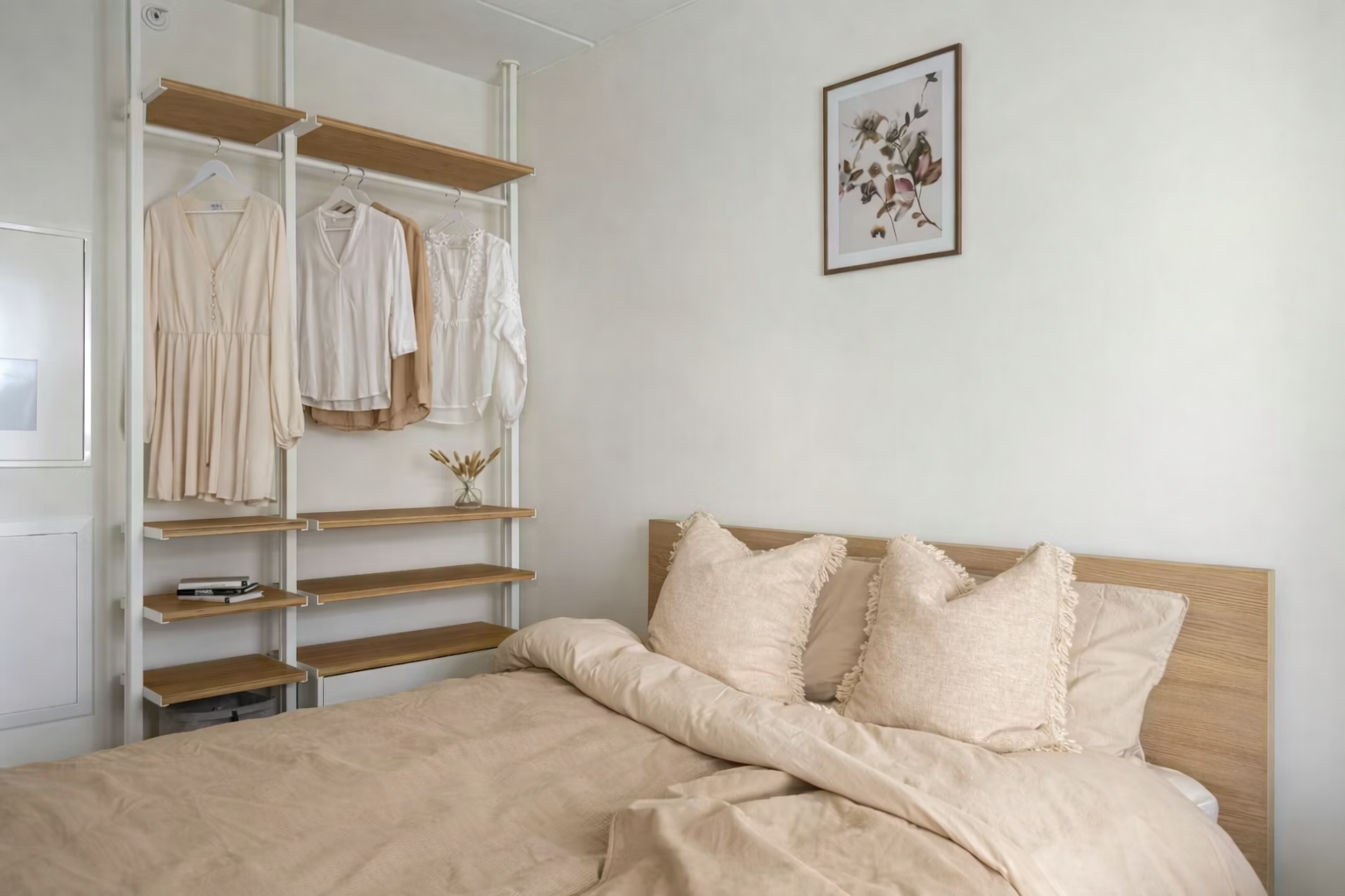
2. Soft Beige
Soft beige adds warmth without heaviness. It introduces comfort into the room and pairs beautifully with wood, linen, woven textures, and natural light. In a Japandi palette, beige often becomes the tone that makes everything feel more lived in.
If you want a bedroom that feels calm but not too plain, soft beige is one of the best places to begin. It holds warmth gently, without ever overwhelming the space.
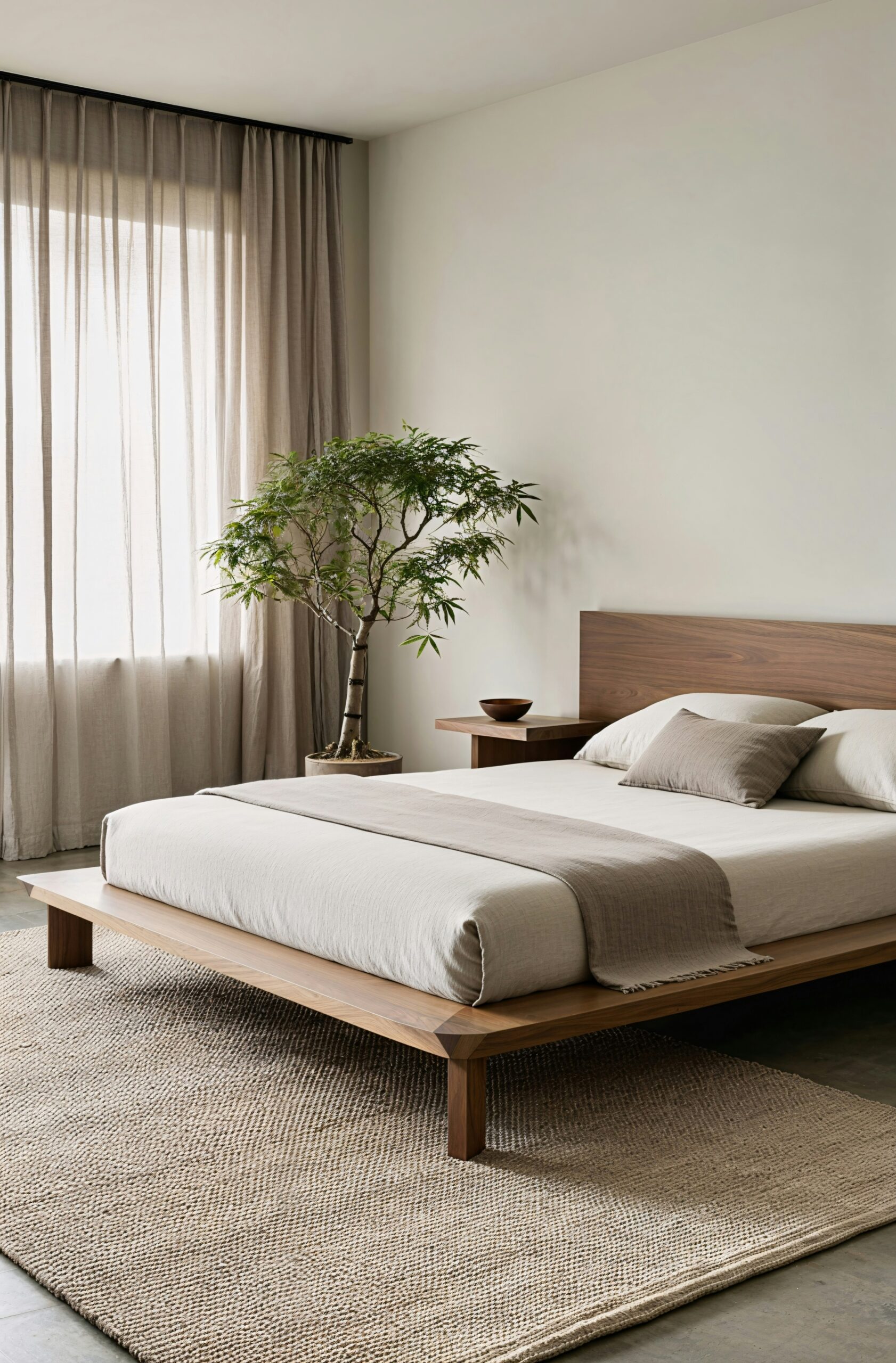
3. Light Oak Wood
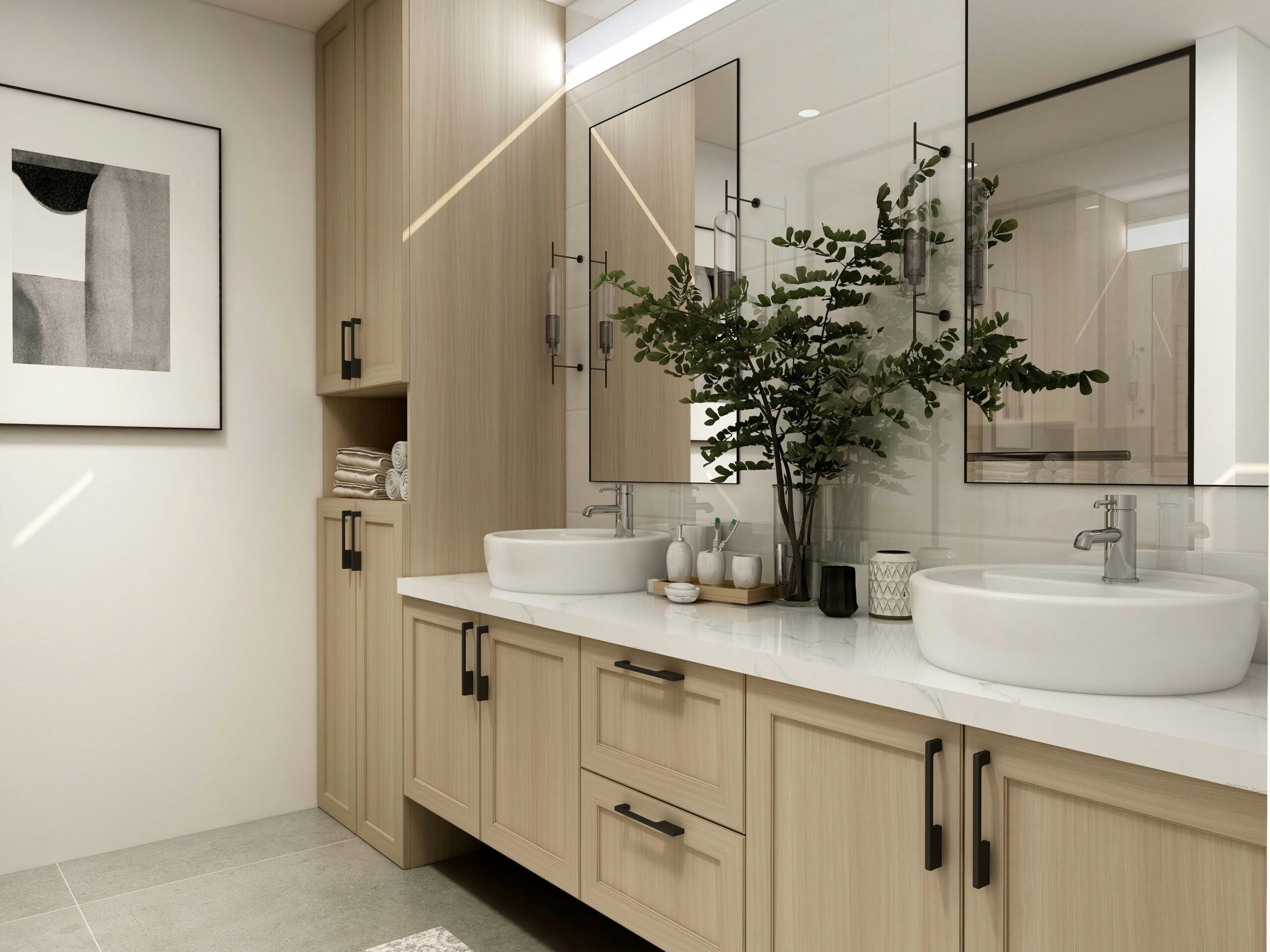
Light oak and natural wood tones are essential in Japandi design because they bring warmth, simplicity, and a direct connection to nature. Wood adds honesty to a room. It introduces grain, movement, and life without visual noise.
Used in furniture, shelving, or flooring, light oak helps create a balanced look that feels both Scandinavian and Japanese — clean, grounded, and naturally inviting.
Color sets the mood. The details make it feel complete.
Once your palette feels right, the next step is letting the room breathe through texture, form, and fewer but better pieces. Calm spaces are rarely built all at once.
4. Muted Gray
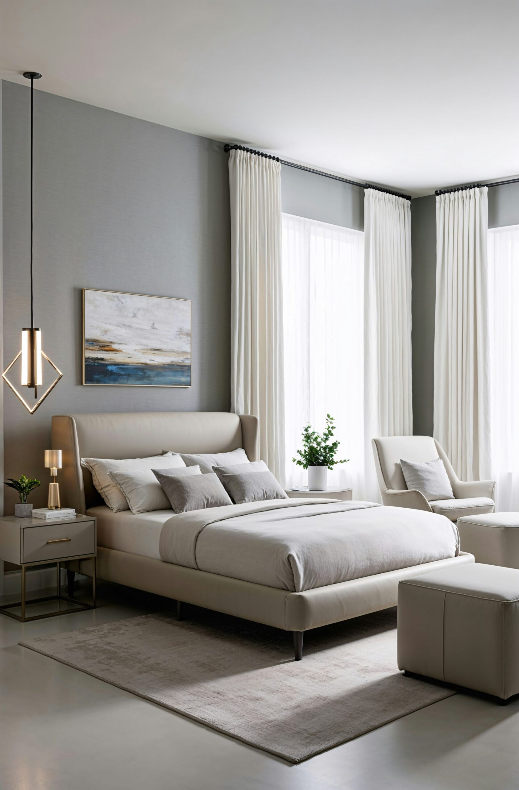
Muted gray brings balance to a warm palette. It softens the overall look and keeps the room from feeling too bright or too sweet. In Japandi interiors, gray often appears in textiles, painted surfaces, or furniture to introduce quiet structure.
It works especially well with wood tones, beige fabrics, and soft lighting because it adds stability without becoming cold. It is the kind of color that helps everything settle.
5. Earthy Brown
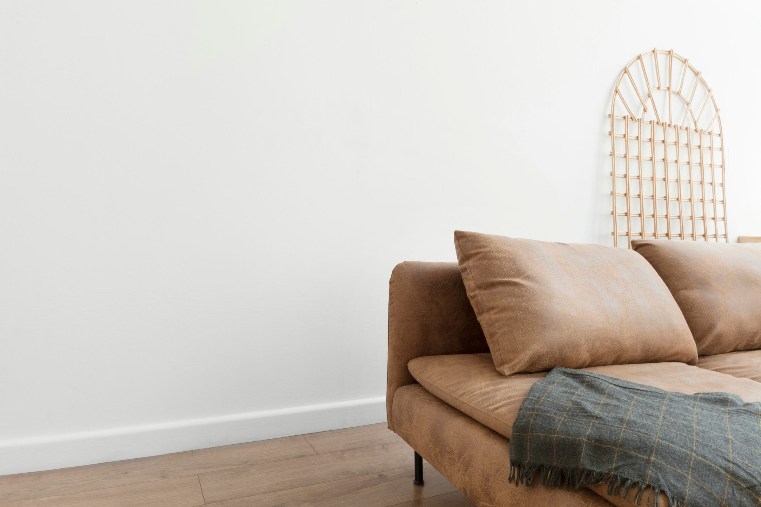
Earthy brown tones bring depth and quiet strength into a Japandi bedroom. Inspired by clay, walnut, leather, and stone, they make the room feel rooted, grounded, and a little more intimate.
Brown works best in small, thoughtful moments — a chair, a blanket, a frame, a vessel — where it can create contrast without overpowering the calm.
6. Soft Sage Green
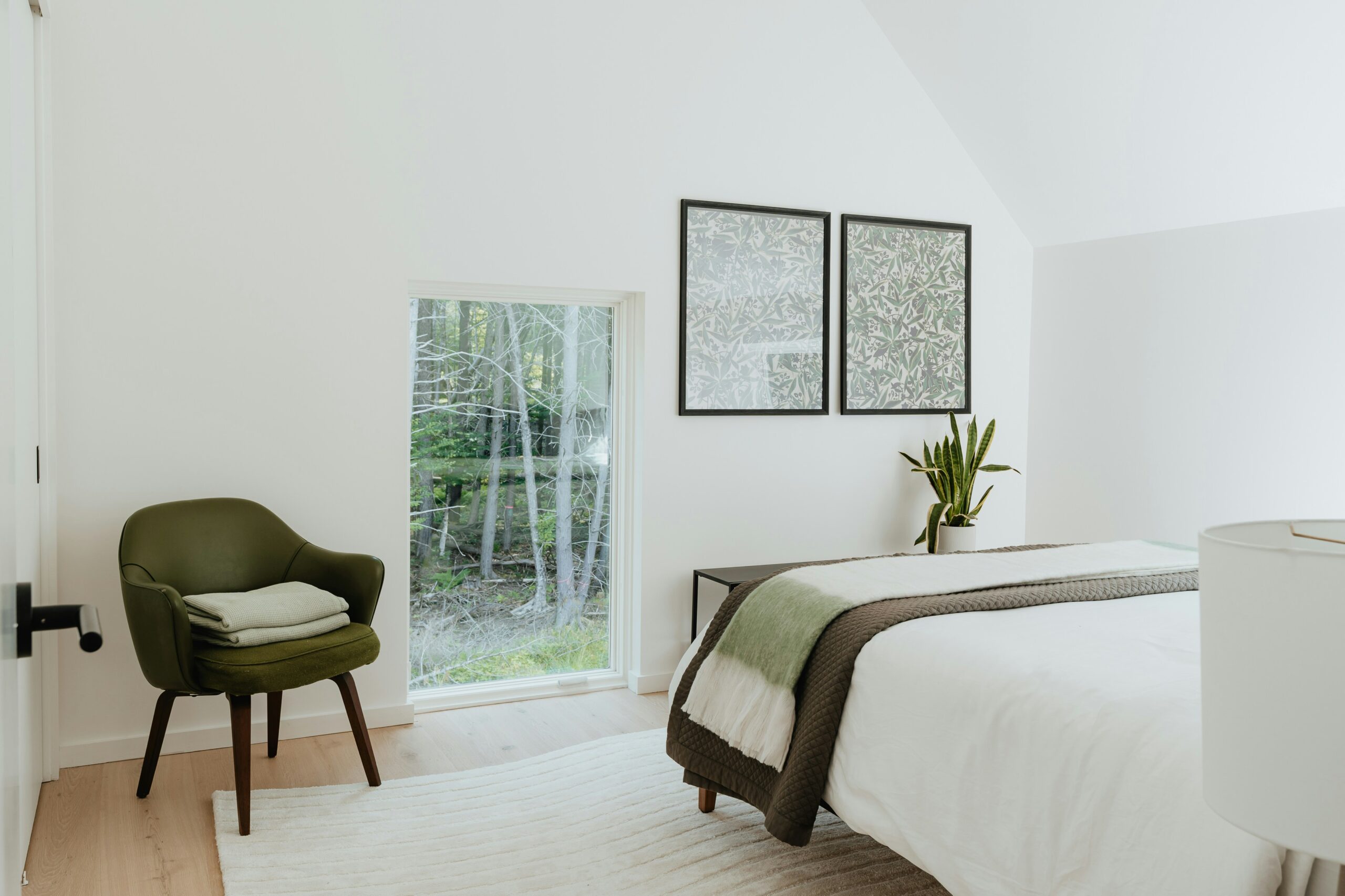
Soft sage green brings a natural, peaceful energy into the room. It is one of the most loved Japandi colors because it adds life without clutter and color without noise. It quietly echoes plants, forests, and open air.
Used in pillows, throws, wall art, or small decor, sage helps a room feel refreshed and gently restored — as if the outdoors has been invited in with care.
7. Charcoal Accent
Charcoal is often the final note in a Japandi palette. It adds contrast, sharpens softer tones, and brings a modern edge to the room without disturbing its calm. A little is enough.
In lamps, frames, metal finishes, or subtle textile details, charcoal gives the palette definition. It completes the room by giving light something deeper to rest against.
Quiet pieces that complete the palette
After the colors are understood, the product layer feels more intentional. These picks support the warm white and muted gray parts of the palette with soft ceramics, organic height, and calm styling pieces that do not interrupt the room.
Neutral Ceramic Vase — Best Overall
A soft ceramic vase that blends beautifully into warm white Japandi spaces. Clean in shape, quiet in tone, and perfect for shelves, consoles, or bedside styling.
Neutral Ceramic Vase — Elegant Pick
A slightly more elevated vase option that still keeps the same Japandi calm. This works beautifully when you want the styling to feel soft, quiet, and a little more refined.
Neutral Ceramic Vase — Alternate Pick
A second vase option with the same quiet Japandi energy — simple, understated, and ideal for adding shape and softness without creating visual noise.
Decorative Grass Accent — Best Overall
A soft decorative grass accent that brings height, texture, and a natural organic feel into muted Japandi spaces without overwhelming the palette.
Decorative Grass Accent — Organic Pick
A second grass option that keeps the same soft, natural mood while giving the room a slightly different organic texture and silhouette.
Ceramic Vase Accent — Styling Pairing
A simple ceramic vase that pairs beautifully with muted gray tones and dried grass styling. This works best as the vessel that completes the organic Japandi look.
Final Thoughts
A Japandi color palette is not simply about what looks beautiful together. It is about what allows a room to feel calm, warm, and quietly whole. The best palettes do not pull for attention — they create an atmosphere you can actually live inside.
Start with warm whites and beige. Bring in natural wood. Add muted gray, soft sage, or a darker accent only where the room asks for it. When choices are made with patience and intention, the space begins to feel less forced and more true.
Warmth begins quietly. Sometimes with color. Sometimes with light. Sometimes with the simple decision to create a home that reflects not just your taste, but your inner steadiness too.
Not everything has to be figured out at once
If this palette helped you slow down and see your space more clearly, keep going gently. Let your home come together one intentional layer at a time.